
Get designs done fast with Skills
Smart workflows crafted for every use case

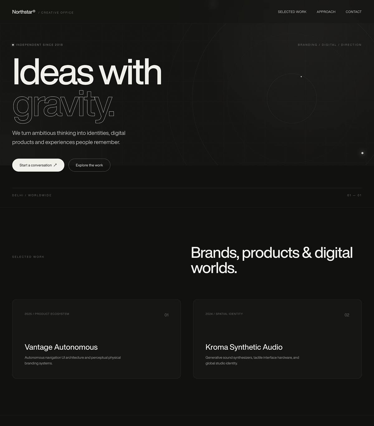
Create a premium, original, full-screen landing page for an independent creative agency

Cloud WD
27 Followers
240 Posts
34 Likes
5.4k Copies


0
LIKES
0
COPIES
189
VIEWS
Stay ahead with Indiater
Get fresh AI prompts, ideas & inspiration every day.
Create a premium, original, full-screen landing page for an independent creative agency called **“Northstar®”**.

The design should feel editorial, sophisticated, experimental, minimal, and high-end — like a modern creative studio — but it must be **completely original** and should NOT copy any existing website, reference design, layout, wording, artwork, animation, or visual identity.

## TECH STACK

Build the website as a **single standalone HTML file**.

Use:

* HTML5
* Tailwind CSS via CDN
* Vanilla JavaScript
* CSS animations
* No React
* No Vue
* No Next.js
* No UI libraries
* No external images
* No stock photography
* No copyrighted artwork

The final output must work simply by opening the `.html` file in a browser.

## FONTS

Load these fonts:

Heading:
`https://db.onlinewebfonts.com/c/5ac3fe7c6abd2f62067f266d89671492?family=HelveticaNowDisplay-Medium`

Body:
`https://db.onlinewebfonts.com/c/1aa3377e489837a26d019bba501e779d?family=HelveticaNowDisplayW01-Rg`

Define:

```css
:root {
  --font-heading: 'HelveticaNowDisplay-Medium', 'Helvetica Neue', Arial, sans-serif;
  --font-body: 'HelveticaNowDisplayW01-Rg', 'Helvetica Neue', Arial, sans-serif;
}
```

Use the heading font only for major headlines and the logo. Use the body font everywhere else.

---

# VISUAL DIRECTION

Create an original dark creative-studio environment.

Base background:

* Almost-black warm charcoal
* Color: approximately `#11110f`

Text:

* Warm off-white
* Color: approximately `#f3f1eb`

Do NOT use a photographic background.

Instead, create a sophisticated generative visual background entirely with CSS:

### Background elements

1. Large thin circular orbital structure on the right side.
2. Multiple extremely subtle concentric circles.
3. Very subtle technical grid covering the screen.
4. Two small floating glowing points.
5. Subtle grain/noise texture generated through CSS/SVG.
6. Soft radial light gradients.
7. Very slow movement of the orbital system.
8. Background should respond subtly to mouse movement.

The result should feel like a mixture of:

* creative technology
* editorial design
* art direction
* premium branding
* digital laboratory

Avoid looking like a generic SaaS website.

---

# NAVIGATION

Create a fixed navigation bar at the top.

Desktop:

Left:

```text
Northstar® / Creative Office
```

The word **Northstar®** should use the heading font.

The `/ Creative Office` text should be much smaller, uppercase, spaced out, and slightly transparent.

Center/right navigation:

```text
Selected work
Approach
Contact
```

Use small white typography.

Add subtle underline animation on hover.

The navigation should remain minimal and elegant.

Mobile:

Replace desktop navigation with a hamburger icon.

Hamburger:

* Three thin horizontal lines
* Animated into an X
* 300ms transition

When opened, display a full-screen dark overlay with:

```text
Selected work

Approach

Contact

hello@northstar.studio
```

Use large editorial typography.

The mobile menu should fade in and links should slightly slide upward when appearing.

---

# HERO

The hero must occupy approximately the full viewport height.

Desktop:

* vertically centered
* generous horizontal padding
* large typography

Mobile:

* content aligned toward the lower portion of the screen
* comfortable spacing
* responsive typography

---

# HERO TOP META

At the top of the hero content create a small status indicator:

A tiny glowing dot followed by:

```text
INDEPENDENT SINCE 2018
```

Use:

* 10–11px typography
* uppercase
* letter spacing
* muted white

On desktop, opposite this element, show:

```text
BRANDING / DIGITAL / DIRECTION
```

Keep it subtle.

---

# MAIN HEADLINE

Create the main headline:

```text
Ideas with
gravity.
```

Make this the dominant visual element.

Typography:

* very large
* tight letter spacing
* heavy/medium display font
* line height around `0.86`
* responsive sizing

Example desktop size:

```css
font-size: clamp(58px, 10.2vw, 154px);
```

The word:

```text
gravity.
```

should be an outline-only treatment.

Use:

```css
color: transparent;
-webkit-text-stroke: 1px rgba(243,241,235,.85);
```

This creates a strong editorial contrast between filled and outlined typography.

Do not copy any other existing site's headline treatment beyond this general typographic technique.

---

# HERO DESCRIPTION

Below the headline:

```text
We turn ambitious thinking into identities, digital products and experiences people remember.
```

Use:

* approximately 19–23px
* relaxed line-height
* maximum width around 520px
* muted white

---

# CTA AREA

Create two modern pill buttons.

Primary:

```text
Start a conversation ↗
```

Style:

* warm white background
* dark text
* rounded pill
* approximately 14px
* generous horizontal padding

Hover:

* transparent background
* white text
* subtle white border

Secondary:

```text
Explore the work
```

Style:

* transparent
* thin white border
* white text
* rounded pill

Hover:

* subtle translucent white background

Both buttons should have a subtle upward movement on hover.

---

# HERO FOOTER

At the bottom of the hero content create a thin horizontal divider.

Below it:

Left:

```text
DELHI / WORLDWIDE
```

Right:

```text
01 — 01
```

Use tiny uppercase typography with low opacity.

---

# ENTRANCE ANIMATIONS

When the page loads:

Animate the hero elements upward into position.

Start state:

```css
opacity: 0;
transform: translateY(22px);
```

End state:

```css
opacity: 1;
transform: translateY(0);
```

Use a smooth cubic-bezier easing.

Stagger the elements:

1. metadata
2. headline
3. description
4. CTA
5. footer

The animations should feel sophisticated and restrained.

---

# INTERACTION

Add subtle mouse interaction to the background.

When the mouse moves:

* slightly translate the atmospheric background
* movement should be extremely subtle
* never move the main content aggressively

Use `requestAnimationFrame`.

Do not use excessive parallax.

---

# ADDITIONAL SECTIONS

The hero should lead into three minimal sections so the navigation links have meaningful destinations.

## SECTION 1 — SELECTED WORK

ID:

```html
#work
```

Label:

```text
SELECTED WORK
```

Large heading:

```text
Brands, products & digital worlds.
```

Dark background consistent with the hero.

Keep the section spacious and editorial.

---

## SECTION 2 — APPROACH

ID:

```html
#approach
```

Label:

```text
APPROACH
```

Large heading:

```text
Clear thinking. Distinct expression.
```

Keep the layout minimal.

---

## SECTION 3 — CONTACT

ID:

```html
#contact
```

Label:

```text
CONTACT
```

Large heading:

```text
Have something worth making?
```

Below it:

```text
hello@northstar.studio
```

Make the email large enough to feel like a CTA and underline it.

Use:

```html
mailto:hello@northstar.studio
```

---

# RESPONSIVE DESIGN

The website must work beautifully at:

* 320px
* 375px
* 390px
* 414px
* 768px
* 1024px
* 1440px
* 1920px

On mobile:

* reduce headline size
* maintain strong typography
* hide desktop navigation
* show hamburger
* prevent horizontal overflow
* keep CTA buttons comfortably tappable
* preserve generous whitespace

---

# ORIGINALITY / COPYRIGHT REQUIREMENT

This is extremely important.

The implementation must be an **original design**.

Do NOT:

* reproduce another website's exact layout
* copy distinctive text
* copy logos
* copy illustrations
* copy photographs
* copy animations
* copy proprietary graphics
* use copyrighted stock assets
* use the previously supplied video
* imitate a specific agency's website pixel-for-pixel

Use only:

* original HTML
* original CSS
* original JavaScript
* CSS-generated shapes
* CSS-generated gradients
* CSS/SVG noise
* original copy provided in this prompt

The visual result should feel premium and creative while being independently designed.

---

# CODE QUALITY

Return only one complete HTML document:

```html
<!doctype html>
<html>
...
</html>
```

Everything must be contained inside that one file.

Include:

* CSS
* JavaScript
* HTML
* Tailwind CDN
* font imports

Do not require a build process.

The final HTML should be ready to upload directly to a website hosting/server.

Make the code clean, semantic, responsive, accessible, and production-ready.
0
LIKES
0
COPIES
189
VIEWS
Stay ahead with Indiater
Get fresh AI prompts, ideas & inspiration every day.
Claim +10 Bonus Credits
Submit your join/follow proof to earn 10 free prompt credits!
Uploading Proof...
Please wait while we secure your screenshot.
Thank You! 🎉
Proof submitted successfully!
Our admin will verify your proof and add +10 Credits to your account within 1–2 hours.